Client Results
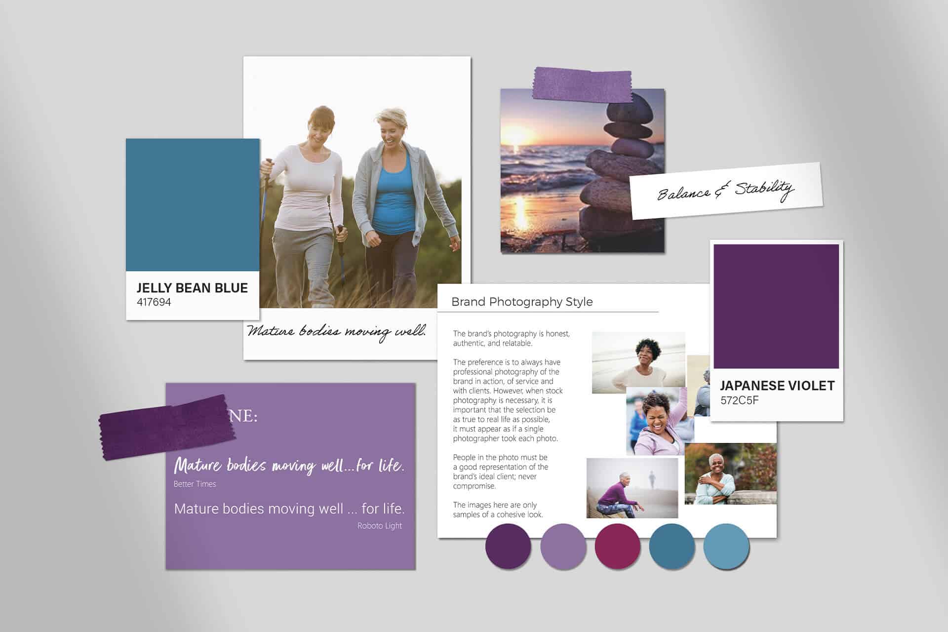
"A foundational identity"
“Before this, I felt like a service professional without a clear identity. I was floundering, unsure what to do first. Having brand clarity gives me a foundational identity to rely on, which impacts everything else I do. It’s one of the greatest business decisions I ever made.”
Susan Silver
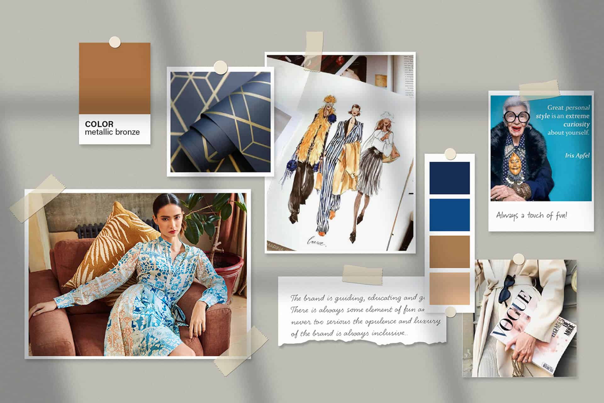
"Elevated my brand"
"My relationship with Sue is truly a partnership. She was the first to help me recognize the importance of personal branding over the brands of the clothing companies I represent. The refreshed logo and website have significantly elevated my brand, perfectly aligning with the quality of the clothing I offer and the personalized service I provide to each client. Sue collaborates with me regularly on brand awareness projects, including social media strategies and weekly client emails. Her dedication to my business is exceptional; she genuinely cares about my success just as much as I do. I always know that I can count on her for guidance in marketing my services and attracting new clients."
Lots of Luxe
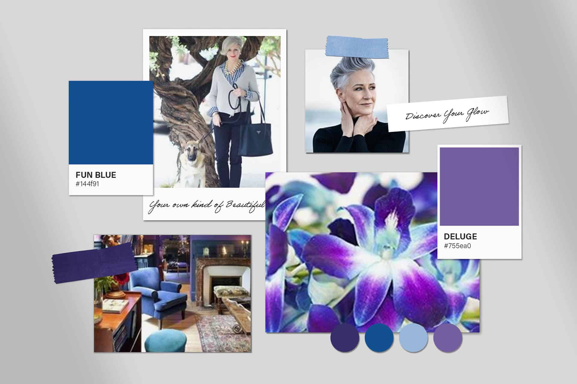
"Invaluable to my entrepreneurial journey"
"Working with Sue for over two decades has been invaluable to my entrepreneurial journey. She has witnessed my personal and professional development and rebranded my business as it evolved, especially during my transition from a brick-and-mortar studio to an online customer experience. Sue took the time to listen deeply, ensuring she understood my business changes and how I wanted my clients to engage with my brand. Her talent for capturing the brand's essence, purpose, and values has shone through in every iteration of my brand identity. I truly believe that Sue will remain a vital part of my journey, even into retirement."
Bev Dwayne
"Every aspect felt just right"
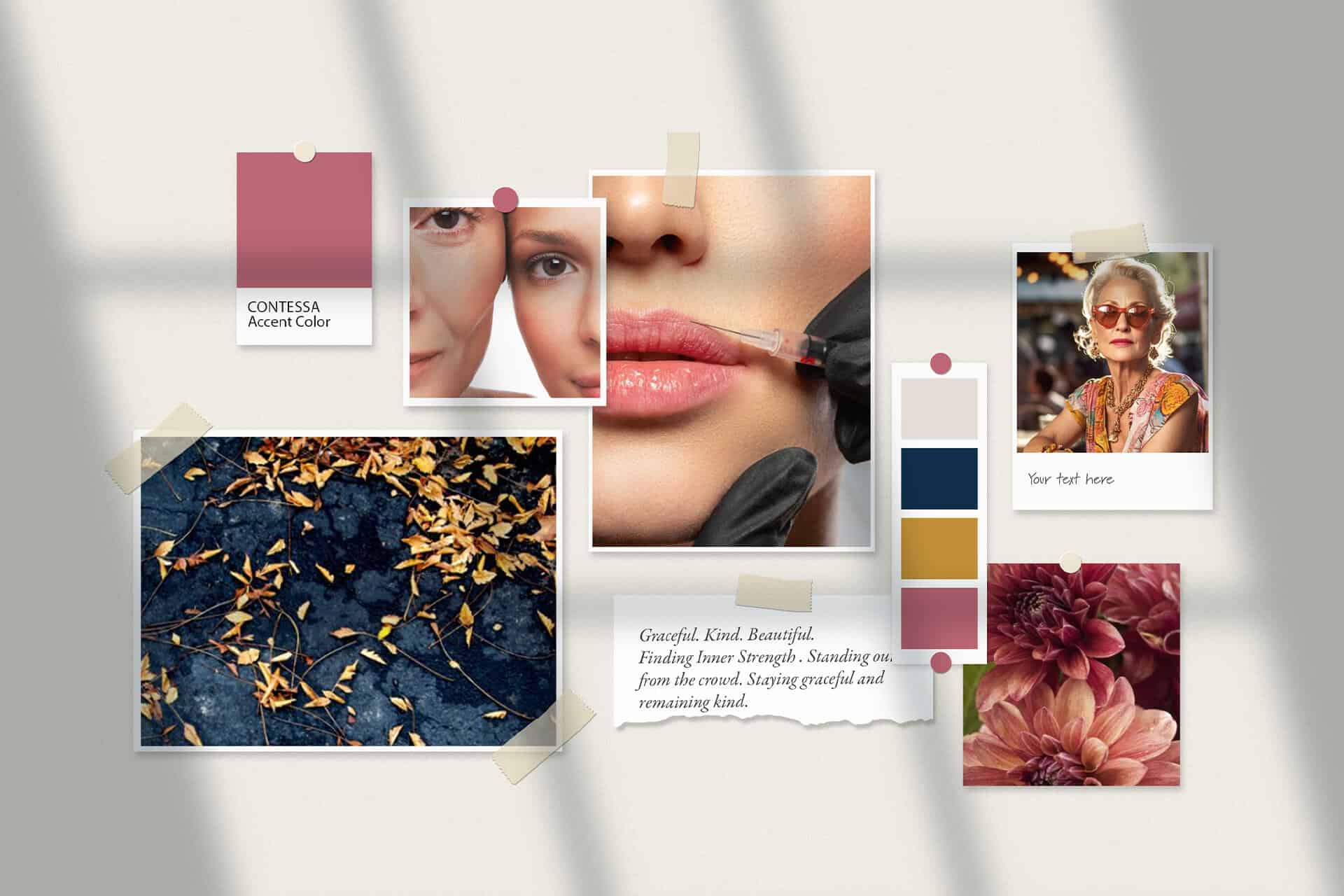
I had an amazing experience working with Sue Forrest for my business branding! Sue took the time to understand my vision, values, and unique style, and turned that into a brand identity that truly reflects who I am and what my business stands for. Her creativity and attention to detail are exceptional, and she went above and beyond to make sure every aspect felt just right. I couldn’t be happier with the result—it’s beautiful, professional, and exactly what I was hoping for.
Carissa Haney
Sue is an invaluable part of our team.
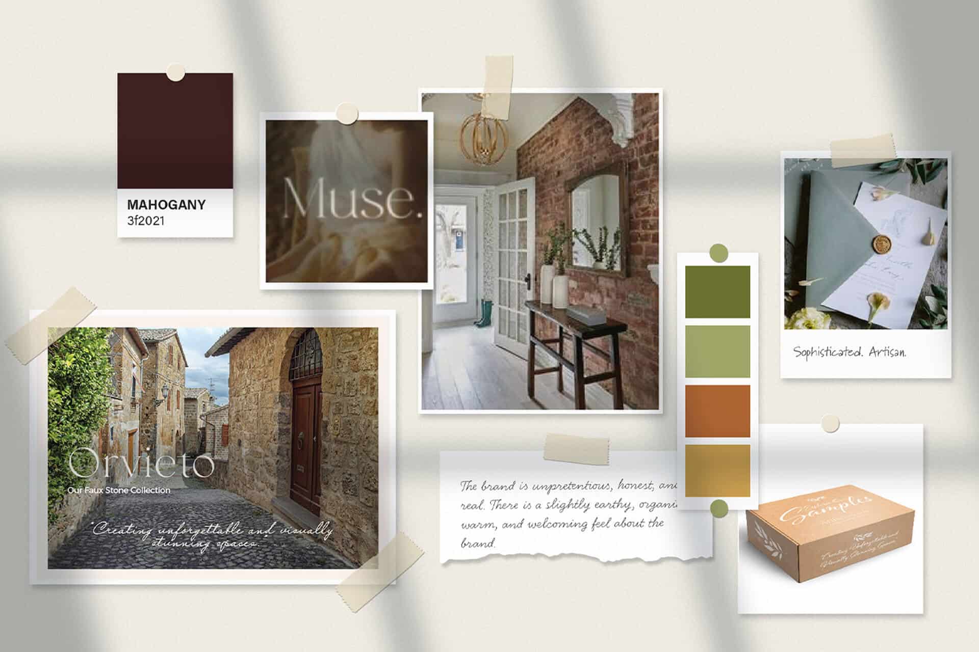
Working with Sue was one of the best decisions we made. She brought my vision for the brand to life, understanding how crucial it was for us to stand out in a sea of sameness in our industry. Sue continues to collaborate with us in all areas of creative direction, helping us develop a stylish brand experience through packaging and marketing collateral designs. She is an invaluable part of our team.
Antico Elements
"Having Sue Forrest as my partner was a game changer..."
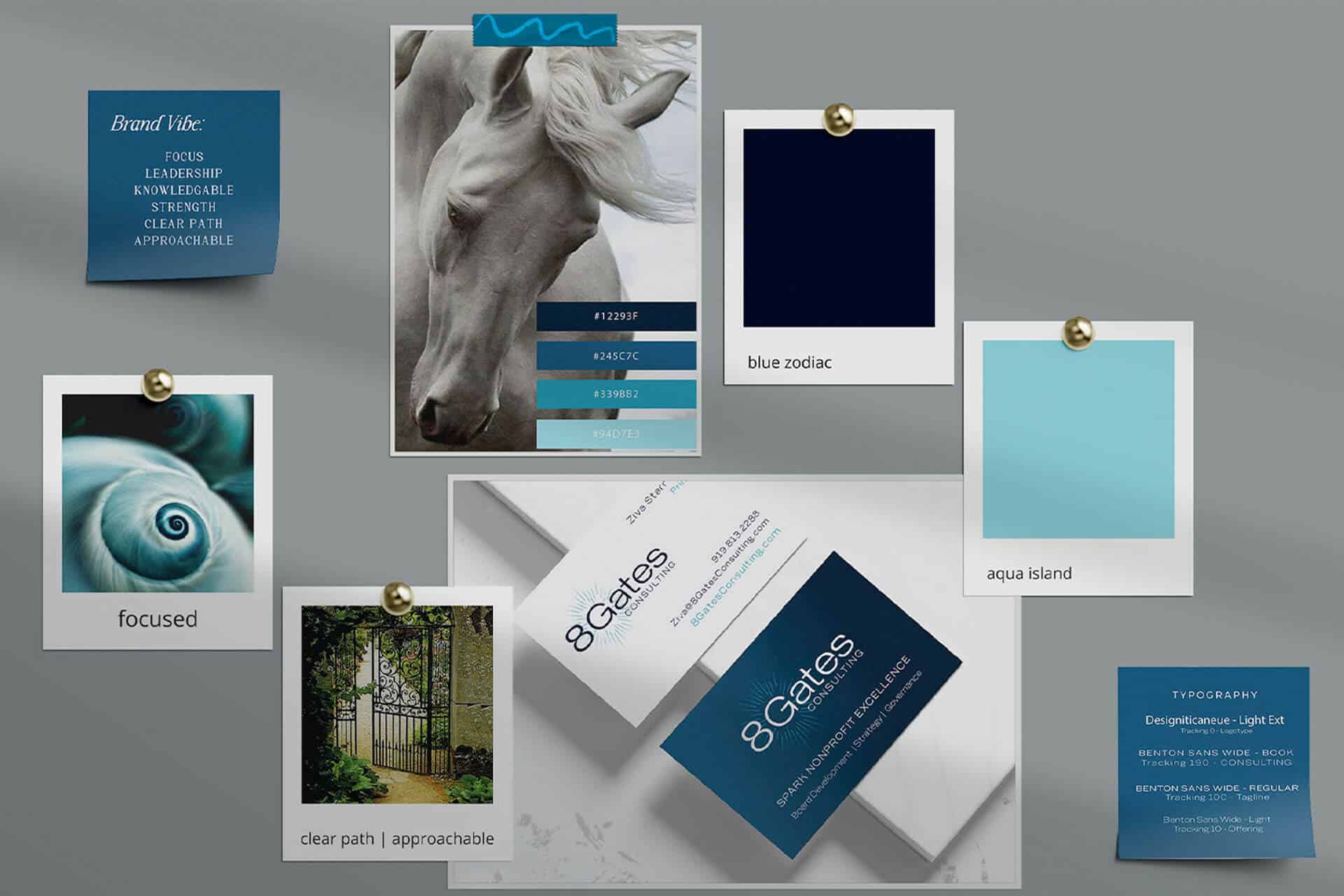
"As a solo practitioner, going out on my own, having Sue Forrest as my partner was a game changer. She took the time to get to know me, my business, and my business plan. She listened to my passion and preferences and helped me develop my brand and image. She was patient with me and helped keep me on track. The talent she and her team bring resulted in a beautiful brand that makes me very proud and a website that fits me and my business."
Ziva Starr Raney
"Such a positive experience..."
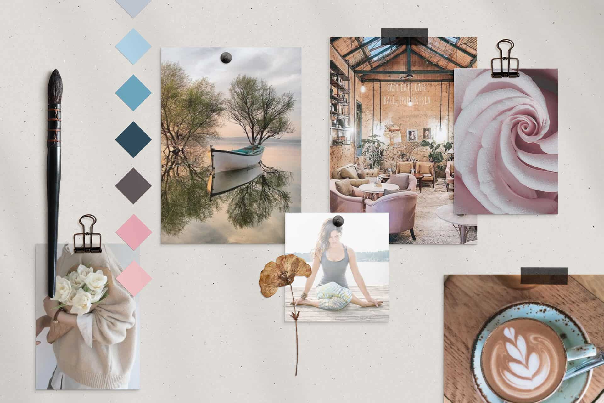
"Working with Sue was such a positive experience! Her expertise and knowledge of designing a brand, along with her thoughtfulness and intuition, created such a powerful space for me to do the inner work needed in the process. She listens intently and provides professional guidance in a way that demonstrates she understands my vision and, through an amazingly collaborative effort, created an end product that I am so excited about. I feel confident in my brand attracting the clients that will benefit from my services and appreciate what I have learned from Sue regarding brand clarity and strategy!"
Mandy Murphy


